I saw that morning with my own eyes.
A queue at the counter. The phone ringing. Someone waiting for change, someone extending a bike for one more hour — and the rental owner, my user, trying to remember where the returns report lives. Under “Reports”? “Analytics”? The third collapsed sidebar section that I put there myself?
In that moment I understood something uncomfortable: my software wasn’t a helper. It was one more person in the queue, demanding attention.
That’s the morning I built the palette for.
The product grows. The human doesn’t
A small menu is fine. But any living product grows: sections, sub-pages, collapsed groups, new reports, new settings. Along with the value grows the cost — the cost of finding things.
And here’s what I noticed about myself as a founder: every new menu item felt to me like “just one more line.” But for a rental owner it was one more address to memorize. Where do triggers live? Under “Marketing”? “Automation”? And SMS settings — is that “Integrations” or “Notifications”?
This already happened to me. I shipped features — real, useful ones — and my biggest client just didn’t touch them. I was frustrated: come on, I built this for you.
Then it turned out he wasn’t ignoring them. He couldn’t find them. They drowned somewhere between the sections I had piled up myself.
So I first built the value, and then hid it in the menu with my own hands. The client didn’t lose interest — he lost the feature.
That was my design failure, not their inattention. A rental owner has no time for my taxonomy. They have a customer standing right in front of them.
That’s how I arrived at my core principle: humans shouldn’t have to learn the structure of my software. My software should understand human intent.
Not “where is it”, but “what do I want”
I live every day in code editors and tools that have a command palette. And at some point it hit me: why have the best professional tools — editors, operating systems, mail — all converged on one mechanic, while I keep building menus?
You don’t recall where a command lives. You just type what you want — and you’re there.
That feels deeply human to me. In real life we never say “open the second drawer of the third cabinet.” We say “please hand me the key.” I wanted to bring that naturalness back to the interface.
So in Turborent it now works like this: press ⌘K (or Ctrl+K) — or tap the glowing orb in the corner. Start typing. Jump anywhere.
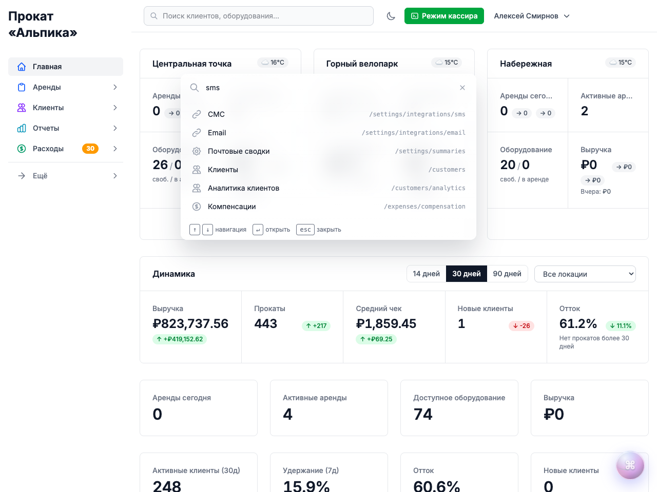
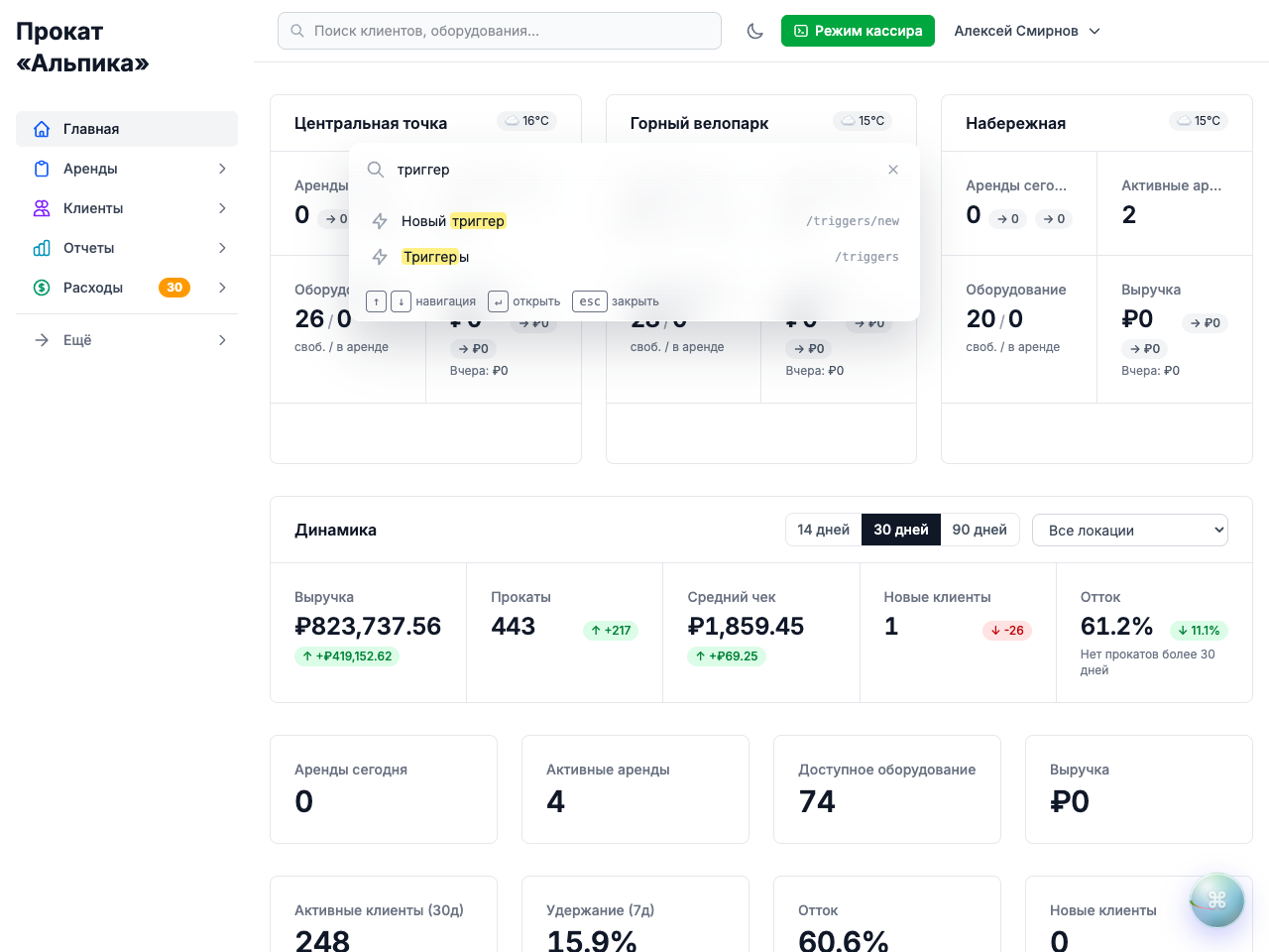
Every page is one query away: from the dashboard to the deepest report. Plus quick actions and everyday commands like switching to dark mode. The matching is fuzzy and bilingual — type “sms” or “триггер”, in either language, and the right screen rises to the top.
No magic. Just respect for your attention — the respect I owed you all along.
It’s not the work that exhausts you. It’s the interface
Rental software is daily software. Dozens of switches a day: checkout, return, phone call, report, checkout again.
Every “where was that?” is a small break in attention. Dozens of breaks — and by evening you’re tired not of customers, but of my menu.
The palette removes those breaks. You don’t “walk the menu” — you keep thinking about the human in front of you while your fingers are already typing the next command.
I believe: a product should never outgrow the people who use it. It should fold down to the size of a single search field.
What I deliberately didn’t do
The palette complements, it doesn’t replace. And these were my hardest decisions — the “no” decisions.
I kept the sidebar — it’s needed for discovery. Sometimes you don’t know what you’re looking for, and wandering through sections, spotting something new, matters. Search can’t surprise you; a good menu can.
And I left the checkout counter untouched. At checkout, hands and eyes are busy: the customer’s phone, the deposit, the bike by the door. What matters there is a focused click-driven flow — a palette would only add an extra keystroke. The team and I deliberately kept it out of where it would get in the way.
Good design isn’t only what you add. It’s also what you refuse to add. Those two “nos” were harder for me than the palette itself.
Where I want to take this
A glimpse a little further ahead — honestly, with no timelines.
Today the palette understands command names. But I keep thinking about what happens when it starts understanding intentions said in your own words. Not “open the extensions section” but “extend this rental till evening.” Not “find the report” but “how much did we make this weekend.”
I’m steering Turborent carefully in that direction. Not as an “AI button for the sake of AI,” but as a continuation of the same idea: the software demands fewer correct clicks and understands more living language.
The palette is the foundation. First I removed the need to remember where things live. The next step is removing the need to phrase things strictly. Only meaning remains: what you want to do for your customer right now.
The direction is honest: from menu — to search, from search — to understanding.
The best interface is invisible
There are interfaces you admire. And there are the ones you stop noticing. I want to build the second kind.
When the whole app is one search field, attention goes where it belongs: to the human across the counter, to the queue that moves faster, to the rental that’s completed before the customer has time to get bored.
Try it: press ⌘K — and just type what you want to do.
And I’ll keep making Turborent less and less visible. So that you become more visible.
Valery, founder of Turborent